
3 Critical Things to Consider When Re-Branding

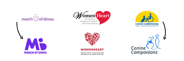
The past year has made many industries and organizations take a deeper look at themselves and many have decided to reassess their brand. Everyone from nonprofits like March of Dimes to companies like Burger King is taking on brand updates. Even Pfizer has launched its most significant brand update in 70 years this past year, and that is only the beginning. More and more organizations are taking on a rebrand.
Over time, your organization will or has evolved and your brand identity should reflect that. Your logo, color palette, slogan, fonts, etc become identifiable and attached to your brand, but as time and trends change, your identity should too. If not, you may look out of date, out of touch, or just stuck behind. Whether you’ve been through the re-brand process or are considering it, here are 3 things that are critical to your rebrand.
Your Color Palette
Color has a huge impact on your brand that is why certain colors are synonymous with brands. Colors like McDonald’s yellow, the Salvation Army’s red, and March of Dime’s purple. Choosing colors can be difficult, but there are certain things to pay attention to. Look at your existing palette with fresh eyes. Look into the psychology behind colors and even competitors within your space. Are you using colors to your advantage and projecting the image you’re seeking? Are you using colors that look good on screen and in print? Since your logo appears in a variety of mediums and brand materials, you will want a color scheme that looks great no matter where it appears.
Your Typography
Does your font fully represent your brand? Does it look better in theory rather than in practice? When you’re looking into fonts, pay close attention to what works and what doesn’t. You should be able to access the font whether you’re working in PowerPoint or in web design. Make sure it is consistent with your messaging, your target audience, and what mediums you’re using to deliver your message. These can dictate whether you’re using a Serif font versus a younger, more hip Sans Serif font. Think of how your message will look on your marketing channels and choose a font that shows up nicely everywhere, is easy to read and makes an impact.
Your Logo
When starting a re-brand, this will probably be your first task. Logos always start off great but as time goes on and trends come and go, it may be important to update your logo. Not only to make it fresh but to reflect where your brand and organization are going. When you make changes to your mission, values, and vision – your logo should reflect those changes. Remember to keep it simple, make an impact, and be appropriate. Jamming a ton of symbols and icons into your logo may seem like a good idea but as an established brand, your logo should have the confidence to speak for your organization. Don’t forget to be adaptable. As we said, your logo will be used on multiple platforms and mediums. Don’t limit yourself but rather consider the channels you’ll be using to deliver your messages and adapt accordingly.
The Big Reveal

Now that you know the pieces that are essential to establishing an updated brand identity, it’s time to announce your new look to the world. Bring your new logo to life with a custom logo charm from Charity Charms! Our charms are handcast in the USA by experienced craftsmen and turn the icons and symbols from your logo into a beautiful work of art. We work with you to utilize your brand colors, fonts, and messaging to create an item that is uniquely yours.

info@charitycharms.com
1940 E. Camelback Rd, Phoenix
By appointment only.
0 Comments